Yes I did…I did not, however, invite you to sit, Lieutenant.
WOODS
Sorry, sir.
ORTEGA
Are you aware that we have just lost contact with the Rodger Young?
WOODS
Everyone’s talking about it, sir.
ORTEGA
Well, I have the video feed from the bridge here. I understand you are the designer of the emergency evasion panel, and the footage raises some fundamental questions about that design. Watch with me now, Lieutenant.
ORTEGA PRESSES A BUTTON ON A CONSOLE ON HIS DESK. F/X: VIDEO WALL
ORTEGA
As you can see, immediately after Captain Deladier issues her order, your panel slides up from a recess in the dash.
(He pauses the video)
WOODS
(After a silence)
Is there a question, sir?
ORTEGA
Why is this panel recessed?
WOODS
To prevent accidental activation, sir.
ORTEGA
But it’s an emergency panel. For crisis situations. It takes two incredibly valuable seconds for this thing to dramatically rise up. What else do you imagine that pilot might have done with those extra two seconds?
WOODS
I…
ORTEGA
Don’t answer that. It’s rhetorical. Next I need you to not explain this layout. Why aren’t the buttons labeled? What does that second one do, and why does it look exactly the same as the emergency evasion button? Are you deliberately trying to confuse our pilots?
(Stares.)
OK, now I actually do want you to explain something.
(Resuming the video)
Why did you cover the panel in glass? Ibanez—and I can’t believe I’m saying this—punches it.
WOODS
The glass is there also to prevent accidental activation, sir.
ORTEGA
But you already covered that with the time-wasting recession. You know she’s likely to have tendon, nerve, and arterial damage now, right? And she’s a pilot, Lieutenant. Without her hands, she’s almost useless to us. And now, in addition to having a giant, peanut-shaped boulder in their face, they’ve got a bridge full of loose glass shards scattered about. Let’s hope the artificial gravity lasts long enough for them to get a broom, or they’re going to be in for some floating laceration ballet.
WOODS
That would be unfortunate, sir.
ORTEGA
Damn right. Now honestly I might be of a mind to simply court martial you and treat you to some good old Federation-approved public flogging for Failure to Design. But today may be your lucky day. I believe your elegant design decisions were exacerbated by the pilot’s being something of a drama queen.
WOODS
The glass was designed to be lifted off, sir.
ORTEGA
(Resuming the video)
Fair enough. My last question…
ORTEGA
Did I see correctly that all of the lights underneath the engine boost light up all at once? The ones labeled POWER ON? AUTO HOME? NOSE RAM? The ones that don’t have anything to do with the engine boost?
WOODS
And…and the adjacent green LED, sir.
ORTEGA
All at once.
WOODS
Sir.
ORTEGA
(Sighs)
Well, as you might not be able to imagine, we’re moving you. After you collect your belongings you are to report to the Reassignment Office.
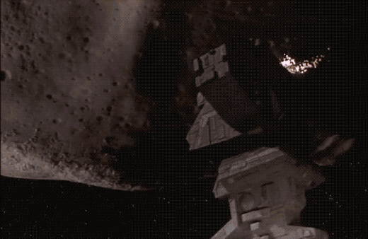
(He scrubs back and forth over the drone video of the communication tower ripping off.)
ORTEGA
Out of curiosity, WOODS, what was the last thing you designed as part of my department?
After letting Captain Deladier know what’s up with the giant asteroid looming spinning ever closer, Barcalow’s attention is grabbed by a screen immediately before him. It’s the collision alarm.
Prepare your eyes.
This is the interface equivalent of running around screaming in an Ed Wynn voice while flailing your arms over your head. Sure, it’s clear something’s wrong, but other than that, it’s not helping.
Sure, there’s the buzzing and the giant yellow, all-caps text that blinks COLLISION ALARM. There’s a pea green bar that seems to be indicating steadily decreasing distance or time or something that is running out. Those two are helpful. The rest of this information is a pile of nonsense.
Blinking? If the pilot has seconds to act, isn’t there a risk that when he glances at the screen for a split second, that he’ll miss something?
What’s with the blue waves rippling out from the representation of the ship? If it’s a collision, wouldn’t you expect something to be represented as coming toward the ship, and maybe a line describing its path, and a point illustrating point of impact?
Why do all of the NV need to be labeled as such? Why do they need to blink randomly? How is that useful information?
How do those numbers link to those labels? Isn’t that asking the navigator to do a lot of visual work in a crisis?
What does it mean for the ESTIMATED MASS to be changing to zero and suddenly jump again? Because that would better fit a Cthulu alarm, as the physics of the Old World no longer applied. Stell’bsna n’ghft. Y’hah.
What does it mean for the APPROXIMATE SPEED to start so low, rise to nearly 1000, and fall again? What outside force is acting on this mass? (Or is it a function of the mass changing? Anyone care to do the speculative math?)
The DISTANCE TO OBJECT does in fact decrease like you might expect it to at the beginning. But then it drops to zero. Shouldn’t they be dieing instead? Oh, but then it jumps again.
Why is time contained in a single number? Does the Federation use some Metric version of time?
How can OBJECT TRAJECTORY be a single digit? It’s a multivariate concept.
Why are there no units? As in, anywhere?
How could OBJECT BEARING change to zero and then jump back up again just like ESTIMATED…
…wait…
…Are you kidding me?
And that’s when I went, frame by frame, and captured the data points. Here they are, visualized as a graph over time. Notice anything?
OK, let me just line those up for you.
I know sci-fi interfaces are often made under time pressure, but it really lets me down when they just copy and paste numbers. Like we won’t, many years later, analyze it frame-by-frame for a blog. Sheesh.
Urgency requires focus
Of course this is a narrative interface, meant to communicate to an audience in about a second that things are very very bad for the Rodger Young. Of course it’s rooted in a mechanical metaphor where dumb, fixed sensors with thresholds would go all calamity when things went pear-shaped.
We don’t live in that world anymore. Urgency requires focus, and when circumstances are dire, yes, the pilot needs to know the direness of the problem, but then they also need to focus on fixing that problem. Urgency interfaces should…
Get attention, and once they have it ease up on the attention getting, since it becomes a distraction.
Illustrate the problem, including time-until-anticipated.
Illustrate what the computer is doing about it (if it’s agentive, which the Rodger Young is clearly not.)
Illustrate the best options available and provide a means to enact those.
Note that the COLLISION ALERT does two and a half of those. It gets Barcalow’s attention, shows the problem with a label, and a green bar shows time remaining. That’s maybe a tenth of the screen. Then it tries its very, very best to distract the user from that useful information with blinking, semi-random nonsense. Was this thing designed by the bugs?
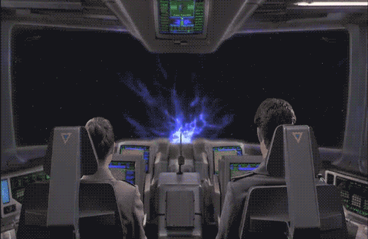
After the gravitic distortion is discovered, Barcalow flips a toggle switch upwards with his thumb. As Ibanez confirms that “Gravity is 225 and rising,” the light on the bridge turns red, and Barcalow turns to a monitor.
The monitor (seen above) features a video window in the top center. Along the left side of the screen 11 random numbers report the COMM STATS INTERSHIP. Along the right side of the screen 11 other random numbers report the COMM STATS INTRASHIP. Beneath the video some purple bars slide in and out from a central column of red rectangles. One of these rectangles is bright yellow. Beneath that a section reports SCANNING FREQUENCIES as 21 three-character strings, some of which are highlighted as red. At the bottom of the screen blue and yellow-green smears race back and forth across a rectangle. Everything is in Starship Troopers‘ signature saturated colors and a block font like Microgramma or Eurostile.
These details are almost immediately obscured, as Deladier looks up from her laptop (looking presciently like a modern Macbook Air with its aluminum casing) to look at the video monitor to demand a “Report,” and the video grows larger to fill the screen.
Here the snarky description must pause for some analysis.
Analysis
The red alert mechanism is actually pretty good. Both the placement of its switch at shoulder level and the fact that it must be flipped up help prevent against accidental activation. The fact that it’s a toggle switch means it can be undone with ease if necessary. The red light immediately provides feedback to everyone on the bridge (and throughout the ship?) that the system has gone into a red alert. No other action is necessary to alert the person who needs to be informed, i.e. the Captain. The only other improvement might be a klaxon warning to alert others who are sleeping, but it’s entirely possible that very thing is happening elsewhere on the ship, and the bridge is spared that distraction. So full marks.
The user interface on the monitor seems pretty crappy though. If someone is meant to monitor COMM STATS—intership or intraship—I cannot imagine how a column of undifferentiated numbers helps. A waveform would be more useful to track activity across a spectrum. Something. Anything other than a stack of numbers that are hard to read and interpret.
The SCANNING FREQUENCIES is similarly useless. Sure, it’s clear that the ship’s systems are scanning those frequencies, but the three-character strings require crew to memorize what those mean. If those frequencies are defined—as you imagine they must be to be at all useful as static variables—then you can remove the cognitive weight of having to memorize the differences between JL5 and LQ7 by giving them actual names, and only displaying the ones that have activity on them, and what that activity means. Does someone need to listen in? Shouldn’t that task be apparent? And why would that need to be shown generally to the bridge, rather than to a communications officer? And I’m not sure what those purple squiggles mean. It’s nice that they’re animated I guess, but if they’re meant to help the user monitor some variable, they’re too limited. Like the sickbay display on the original Star Trek, knowing the current state is likely not as useful as knowing how the information is trending over time. (See page 261 for more details on this.) So trendlines would be better here. The little sweeping candy colored smears are actually okay, though, presuming that it’s showing that the system is successfully sweeping all frequencies for additional signal. Perhaps a bit distracting, but easy to habituate.
It’s nice that the video screen fills the screen to match the needs of the communicators. But as with so many other sci-fi video calls, no effort is made to explain where the camera is on this thing. Somehow they can just look at the eyes of the other person on the monitor, and it works. This feels natural to the actors, looks natural to the audience, and would be natural in real life, but until we can figure out how to embed a camera within a screen, this can’t work this way, and we’re stuck with the gaze monitoring problem raised in the Volumetric Projection chapter of the book with the Darth Vader example.
So, all in all, this interface is mostly terrible until it becomes just a videophone. And even then there are questions.
Snarky description continues
Picking up the description where I left off, after the Captain demands a report, Barcalow tells her quickly “Captain, we’re in the path of an unidentified object heading toward us at high speed.” Ibanez then looks down at her monitor at the gravity well animation, to remark that the “Profile suggests an asteroid, ma’am.” You know, just before looking out the window.
Honestly, that’s one of the funniest two-second sequences in the whole movie.
As Ibanez and Barcalow are juuuuuust about to start a slurpy on-duty make out session, their attention is drawn by the coffee mug whose content is listing in the glass.
Ibanez explains helpfully, “There’s a gravity field out there.” Barcalow orders her to “Run a scan!” She turns to a screen and does something to run the scan, and Barcalow confirms that “Sensors [are] on” As she watches an amber-colored graticule distort as if weighed down by an increasingly heavy ball while a Big Purple Text Label blinks GRAVITIC DISTORTION. Two numbers increment speedily at the bottom-right edge of the screen and modulus at 1000. “There,” she says.
So many plot questions
What kind of coffee cups can withstand enough gravity to tip the contents 45 degrees but remain themselves perfectly still and upright?
Why did they need the coffee cup? Wouldn’t their inner ear have told them the same thing faster?
Why is the screen in the background of the coffee cup still blinking OPTIMAL COURSE?
Of course we have to put these aside in favor of the interaction design questions.
First the “workflow”
Why on earth would they need to turn on sensors? Aren’t the sensors only useful when they’re sensing? If you have a sense that something is wrong, turning on the sensors only confirms what you already know. This is still more of that pesky stoic guru metaphor. This should have been an active academy that warned them—loudly—the moment nearby gravity started looking weird.
The visualization is not bad…
Let’s pause the criticism for one moment to give credit where credit is due. The grid vortex is a fast and reliable way to illustrate the invisible problem that they’re facing and telegraph increasing danger. Warped graticules have been a staple of depicting spacetime curvature since Disney’s 1979 movie The Black Hole.
The gravity well as depicted in The Black Hole (1979).
This is also the same technique that scientists use to depict the same phenomenon, so it’s got some street cred, too.
NASA artist concept of Gravity Probe B orbiting the Earth to measure space-time, a four-dimensional description of the universe including height, width, length, and time.
NASA’s Ripples in spacetime generated by fast orbiting stars (neutron stars, white dwarws or black holes).
From Jonsson, Rickard M. “Visualizing Curved Spacetime.” American Journal of Physics 73.3 (2005): 248. Web.
The same thing can be shown in 3D, but it’s visually noisier. Moreover, the 2D version builds on our sense of basic physics, as we can easily imagine what would happen to anything nearing the depression. So, it’s mostly the right display.
…But then, the interaction
Despite the immediacy of the display, there’s a major problem. Sure, this interface conveys impending doom, but it doesn’t convey any useful information to help them know where the threat is coming from or what to do about it after they know that doom impends. (Plus, they had to turn it on, and all it tells them is, “Yep, looks pretty bad out there.”) To design this right, they need a sense of the 3D vector of the threat as compared to their own vector, and what the best available options are.
Better: Augmented reality to telegraph the invisible threat
Fortunately, we already have the medium and channel for Ibanez and Barcalow to immediately understand the 3D direction of the threat in the real world and most importantly, in relation to the ship’s trajectory and orientation, since that’s the tool they have on hand to avoid the threat. We’ve already seen that volumetric projection is a thing in this world, so the ship should display the VP just outside the ship’s viewports. The animation can illustrate the threat coming from the outside on the outside, and fade once the threat gets to be in a range of visible light. In this way there’s no 2D to 3D interpretation. It’s direct. Where’s the unexpected gravitic distortion? Look out the window. There. There is the the unexpected gravitic distortion. The HUD display would need to be aimed at the navigator’s seat, but for very distant objects, e.g. out of visible light range, the parallax shift wouldn’t be problematic for other locations on the bridge. You’d also have to manage the scenario where the threat comes from a direction not out the window (like, say, through the floor) but you can just shift the VP interior for that.
Next, you could use VP inside the ship to show the two paths and point of collision, as well as best predicted paths (there’s that useful active academy metaphor again.) Then we can let Ibanez trust her own instincts as she presses the manual override to steer the ship clear. I don’t have the time to comp an internal VP up right now, so I’ll rely on your imagination to comp this particular part of a much better solution than what we see on screen.
In the prior post, I spoke about how the COURSE OPTIMAL betrays the writer of Starship Trooper’s mental model of technology as a “stoic guru” and implored writers to shift that model to one of an “active academy.” It’s a good post (if I do say so myself). Check it out if you haven’t yet.
But this blog is ostensibly for interaction design (also a thinly veiled rèsumè for my wealthtastic and fameulous future career consulting for sci-fi movies). What do the stoic guru and active academy metaphors do for us?
Is it only for strategists?
To change a writer’s metaphor is to encourage them to conceive of technology differently at a strategic level. That is, what strategic role does the technology play in its users’ lives? If you as an interaction designer have the luxury of consulting on projects at a strategic level, then this metaphor is as powerful for you as it is for the writer. Are you writing scenarios where your personas query technology? Or is the technology getting to know its user and then doing work for them? (Don’t worry, there’s plenty for interaction designers to still do.)
In-house designers—are often inheriting projects where the strategy was done by someone else, a fait accompli. What if you weren’t asked about the strategic implications of the design task at hand (but you’re still thinking of them?) Here I must encourage some upstartness, some whippersnappery piss n’ vinegar. I used to work with a smaller interaction design consultancy in my day job, and even then we never let a design brief get in the way of a great idea. That is, we will solve the problem as the client frames it first, and then deliver a But Wait, There’s More second idea for consideration if not for this project, then for a later project. Even if it can’t be acted on in the moment, it can plant a seed that germinates later.
So don’t fret if it’s not your job. Make it part of your job to send these ideas up the chain, and more than likely it will eventually become your job. Sure, design the thing, but then design thing you want to design.
In Starship Troopers, after Ibanez explains that the new course she plotted for the Rodger Young (without oversight, explicit approval, or notification to superiors) is “more efficient this way,” Barcalow walks to the navigator’s chair, presses a few buttons, and the computer responds with a blinking-red Big Text Label reading “COURSE OPTIMAL” and a spinning graphic of two intersecting grids.
Yep, that’s enough for a screed, one addressed first to sci-fi writers.
A plea to sci-fi screenwriters: Change your mental model
Think about this for a minute. In the Starship Troopers universe, Barcalow can press a button to ask the computer to run some function to determine if a course is good (I’ll discuss “good” vs. “optimal” below). But if it could do that, why would it wait for the navigator to ask it after each and every possible course? Computers are built for this kind of repetition. It should not wait to be asked. It should just do it. This interaction raises the difference between two mental models of interacting with a computer: the Stoic Guru and the Active Academy.
Stoic Guru vs. Active Academy
This movie was written when computation cycles may have seemed to be a scarce resource. (Around 1997 only IBM could afford a computer and program combination to outthink Kasparov.) Even if computation cycles were scarce, navigating the ship safely would be the second most important non-combat function it could possibly do, losing out only to safekeeping its inhabitants. So I can’t see an excuse for the stoic-guru-on-the-hill model of interaction here. In this model, the guru speaks great truth, but only when asked a direct question. Otherwise it sits silently, contemplating whatever it is gurus contemplate, stoically. Computers might have started that way in the early part of the last century, but there’s no reason they should work that way today, much less by the time we’re battling space bugs between galaxies.
A better model for thinking about interaction with these kinds of problems is as an active academy, where a group of learned professors is continually working on difficult questions. For a new problem—like “which of the infinite number of possible courses from point A to point B is optimal?”—they would first discuss it among themselves and provide an educated guess with caveats, and continue to work on the problem afterward, continuously, contacting the querant when they found a better answer or when new information came in that changed the answer. (As a metaphor for agentive technologies, the active academy has some conceptual problems, but it’s good enough for purposes of this article.)
Consider this model as you write scenes. Nowadays computation is rarely a scarce resource in your audience’s lives. Most processors are bored, sitting idly and not living up to their full potential. Pretending computation is scarce breaks believability. If ebay can continuously keep looking on my behalf for a great deal on a Ted Baker shirt, the ship’s computer can keep looking for optimal courses on the mission’s behalf.
In this particular scene, the stoic guru has for some reason neglected up to this point to provide a crucial piece of information, and that is the optimal path. Why was it holding this information back if it knew it? How does it know that now? “Well,” I imagine Barcalow saying as he slaps the side of the monitor, “Why didn’t you tell me that the first time I asked you to navigate?” I suspect that, if it had been written with the active academy in mind, it would not end up in the stupid COURSE OPTIMAL zone.
Optimal vs. more optimal than
Part of the believability problem of this particular case may come from the word “optimal,” since that word implies the best out of all possible choices.
But if it’s a stoic guru, it wouldn’t know from optimal. It would just know what you’d asked it or provided it in the past. It would only know relative optimalness amongst the set of courses it had access to. If this system worked that way, the screen text should read something like “34% more optimal than previous course” or “Most optimal of supplied courses.” Either text could show some fuigetry that conveys a comparison of compared parameters below the Big Text Label. But of course the text conveys how embarrassingly limited this would be for a computer. It shouldn’t wait for supplied courses.
If it’s an active academy model, this scene would work differently. It would have either shown him optimal long ago, or show him that it’s still working on the problem and that Ibanez’ is the “Most optimal found.” Neither is entirely satisfying for purposes of the story.
How could this scene have gone?
We need a quick beat here to show that in fact, Ibanez is not just some cocky upstart. She really knows what’s up. An appeal to authority is a quick way to do it, but then you have to provide some reason the authority—in this case the computer—hasn’t provided that answer already.
A bigger problem than Starship Troopers
This is a perennial problem for sci-fi, and one that’s becoming more pressing as technology gets more and more powerful. Heroes need to be heroic. But how can they be heroic if computers can and do heroic things for them? What’s the hero doing? Being a heroic babysitter to a vastly powerful force? This will ultimately culminate once we get to the questions raised in Her about actual artificial intelligence.
Fortunately the navigator is not a full-blown artificial intelligence. It’s something less than A.I., and that’s an agentive interface, which gives us our answer. Agentive algorithms can only process what they know, and Ibanez could have been working with an algorithm that the computer didn’t know about. She’s just wrapped up school, so maybe it’s something she developed or co-developed there:
Barcalow turns to the nav computer and sees a label: “Custom Course: 34% more efficient than models.”
BARCALOW
Um…OK…How did you find a better course than the computer could?
IBANEZ
My grad project nailed the formula for gravity assist through trinary star systems. It hasn’t been published yet.
BAM. She sounds like a badass and the computer doesn’t sound like a character in a cheap sitcom.
So, writers, hopefully that model will help you not make the mistake of penning your computers to be stoic gurus. Next up, we’ll discuss this same short scene with more of a focus on interaction designers.
While on “third watch” on the bridge, Barcalow brings Ibanez a cup of coffee and they hang out a bit. Looking at the screen, he notes that “something’s wrong.” He reaches down and presses a button, and a screen appears with the label PLOTTING COURSE. A small yellow circle zeroes in on their spot in space, labeled in green as CURRENT POSITION (with “galactic” XYZ coordinates listed beneath). Then a yellow circle zeroes in on their destination, labeled in blue as TARGET DESTINATION. (With fuigetry from her earlier interfaces lining the top and bottom.) Each dot becomes two squares that slide into place on a side-by-side comparison screen with an efficiency analysis below.
Ibanez explains that she replotted the course, it being “more efficient this way.” To check it he walks to a different computer, which we’ll discuss in the next post. Even though this little interaction takes place over a few seconds, already there are things that need to be discussed before we move on.
Why wasn’t he notified?
Barcalow only finds out about the change to the course by coming to the bridge and observing something on a screen there. Any system that knows its user (and recall that Ibanez had to log in to her station) should know and respect the authority chain of its users. With only three weeks of experience at the helm, it seems more likely that Ibanez should have had to submit a plan for consideration rather than being able to just grabbing the wheel while everyone else is asleep. Seems like a hijacking waiting to happen. More sensibly, Barcalow should have come onto the bridge with the coffee saying, “I saw you submitted a new course. That’s a pretty bold move, ensign. Want to show it to me over a cup of this here space jo?” Then we’d get the idea that there’s an actual chain of authority in this military.
Even if Ibanez has the authority to alter the course without approval, her superior officer (at least) should be notified of the change immediately, so he could be aware and check up on it if he needed to.
Why is this information on a tiny screen?
Everyone on the bridge should be aware of the same basic bits of information. It’s one of the main reasons you get people clustered together in a bridge or a mission control center in the first place. Shouldn’t this be some of that basic information? If so, why is it only appearing on a tiny screen that Barcalow happens to glance at because he’s trying to woo Ibanez? Do they always have to hire womanizing superior officers? Better is a shared information source like Star Trek’s viewscreens where some glanceable mission information—like progress against course—can be seen by everyone.
Cartesian coordinate system
I do want to credit the interface designer for including 3D coordinates. Sci-fi can fall into the trap of treating spaceships as if they were seagoing vessels floating on a 2 dimensional surface like the sea. Props for acknowledging that the ship is moving through three dimensions. And Cartesian coordinates are nice in that anyone who has completed remedial geometry will be familiar with Descartes’ coordinate system. (Though I doubt that Cartesian Coordinates would be the actal system being used in space. It’s much more likely to be something like the International Celestial Reference System or even sweet-looking Keplerian graphs.) But narratively, showing 3D coordinates is a step in the right direction. But we can do René one better for both the audience and the navigators.
Show don’t tell
Otherinterfaceson the bridge already showed us that the system is capable of displaying 3D information. On this screen, it would be better to show the plotted course and the point at which the ship is along it.
Of course space travel is likely to be incredibly boring with long stretches of straight-line travel through vast swaths of emptiness. But this is sci-fi, so let’s presume that its path includes gravity assist fly-bys of stars. That gives the display useful markers for orientation and something for Barcalow to look at to realize how the course has changed. Then when he needs to compare, he presses the left arrow key and can see the old path overlaid in a new color in the display, letting him (and us the audience) see the change in course rather than be told about it. Numbers can overlay this display to provide exact details, but it would augment the immediate understanding offered by the 3D.
First off, let me apologize for the terrible flashing that is this next interface.
After "designing a course to Jupiter" using STARNAV, Barcalow presses something that initiates the warp drive.
He speaks along with a broadcast voice to countdown, "Star drive in…5…4…ready…steady…GO!"
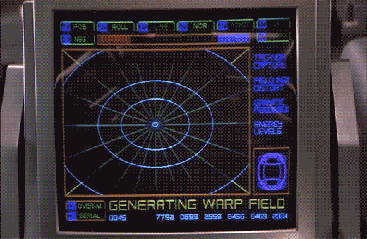
The next screen shows a polar grid labeled GENERATING WARP FIELD. Circular rings shrink towards the center of the grid. Text along the right reads TACHYON CAPTURE, FIELD INGH DISTORT, GRAVITIC FEEDBACK, and ENERGY LEVELS. Bits of the fuidgitry from the STARNAV screens are occluded by a progress bar and a string of unchanging numbers: 0045 4535 7752 0659 2958 6456 6469 2934.
The first part of this display makes sense. It’s providing feedback to the navigator that it’s progressing in a task, i.e. generating the warp field. The animated circles provide some glanceable confirmation that things are progressing smoothly, and the implied concentration of power in a single point tells that whatever it’s building to, it’s gonna be big. Of course we can probably do without the numbers and tabs since they don’t change and it’s not really a touch screen. It would also be good to monitor whatever metrics we should be watching to know if things are safe or trending dangerously, maybe with sparklines, like a medical monitoring interface. Perhaps though that’s the sort of screen better suited to engineering. After all, Barcalow and Ibanez are just navigating and piloting here, respectively.
Then the progress bar suddenly turns purple, then the whole purple grid flashes multiple colors as we hear rapid electronic beeping (amongst a swell of extra-diegetic orchestra brass). Finally, a white circle grows from the center outward to fill the screen as the ship passes into Star Drive.
At first the white screen might seem like a waste, since this is when the navigator’s job really begins, as they go careening through space hurtling towards potentially life-threatening obstacles. But that white background can provide a clear background for a radar view (or Starship Trooper equivalent), a canvas for him to scan for any threats that radar are picking up beyond the field of vision afforded by the viewport. So the "wasted" space isn’t a problem at all.
The flashes are a bit of a problem. What’s it doing that for? Is it trying to put them into an epileptic seizure just before engaging in potentially deadly activity? Or is a seizure the only way to survive the perils of Stardrive? It’s unclear and dubious that there’s any good reason. Interaction designers are rarely in the business of putting users into a grand mal.
The color and values are also problematic. Why the candy colors? Does the orange flash mean something different than the purple flash? Even if you got rid of all the circus themed colors, there’s still a blinding amount of white on the screen once warp is engaged. That canvas would work a lot better as a black background with white blips to avoid eye fatigue, especially over long spans of time.
To travel to Jupiter, navigator Zander must engage the Star Drive, a faster than light travel mechanism. Sadly, we only see the output screens and not his input mechanism.
Captain Deladier tells Ibanez, "Steady as she goes, Number 2. Prepare for warp."
She dutifully replies, "Yes m’am."
Deladier turns to Barcalow and tells him, "Number 1, design for Jupiter orbit."
In response, he turns to his interface. We hear some soft bleeping as he does something off screen, and then we see his display. It’s a plan view of the Solar system with orbits of the planets described with blue circles. A slow-blink yellow legend at the top reads DESIGNATING INTRASYSTEM ORBITAL, with a purple highlight ring around Earth. As he accesses "STARNAV" (below) the display zooms slowly in to frame just Jupiter and Earth.
STARNAV
As the zoom starts, a small box in the lower right hand corner displays a still image of Mars with a label LOCAL PRESET. In the lower left hand corner text reads STARNAV-0031 / ATLAS, MARS. After a moment these disappear replaced with STARNAV-3490 / ATLAS, NEPTUNE, STARNAV-149.58 / ATLAS URANUS, STARNAV-498.48 / ATLAS, SATURN, and finally STARNAV-4910.43 / ATLAS JUPITER. The Jupiter information blinks furiously for a bit confirming a selection just as the zoom completes, and DESIGNATING INTRASYSTEM ORBIT is replaced with the simpler legend COURSE. Jupiter has a yellow/orange ring focus in on it as part of the confirmation.
Some things that may be obvious, but ought to be said:
How about "Destination" instead of "Local preset"? The latter is an implementation model. The former matches the navigator’s goals.
Serial options are a waste here. Why force him to move through each one, read it to see if that’s the right one, and then move on? Wouldn’t an eight-part selection menu be much, much faster?
The serial presentation is made worse in that the list is in some arbitrary order. It’s not alphabetical: MNUSJ? It’s not distance-order either. He starts at 4, he jumps to 8, 7, and 6 before reaching 5, which is Jupiter. Better for most default navigation purposes would be distance order. Sure, that would have meant only one stop between Earth and Jupiter. If you really needed more stops for the time, start at Mercury.
What are those numbers after "STARNAV-"? It’s not planet size, since Uranus and Neptune should be similar, as should Saturn and Jupiter. And it’s not distance, since Jupiter has the largest number but is not the fathest out. Of course it could be some arbitrary file number, but it’s really unclear why the navigator would need to know this when using the screen. If a number had to be there, perhaps a ranking like Sol-V Best would be to get rid of any information that didn’t help him with the microinteraction.
How about showing the course when the system has determined the course?
NUI would be better. When he looks at that first screen, he should be able to touch Jupiter or its orbit ring.
Agentive would be best. For instance, if the system monitors the conversation on the bridge, when it heard "design for Jupiter," it could prepare that course, and let the navigator confirm it.
Sneakily agentive?
Regular readers of my writing know that agentive tech is a favorite of mine, but in this case there is some clue that this is actually what happened. Note that the zoom to frame Earth and Jupiter happens at the same time as he’s selecting Jupiter. How did it know ahead of time that he wanted Jupiter? He hadn’t selected it yet. How did it know to go and frame these two planets? Should he select first and this zoom happen afterward? Did it actually listen to Deladier and start heading there anyway?
No.
It would be prescient if this throwaway interface was some secret agentive thing, but sadly, given that the rest of the interfaces in the film are ofttimes goofy, powered controls, it’s quite likely that the cause and effect were mashed together to save time.
STARNAV fuigetry
Though I can’t quite make sense of them (and they don’t change in the sequence), for the sake of completeness, I should list the tabs that fill the top and bottom of the screen, in case its meaning becomes clear later. Along the top they have green tab strokes, and read from left to right POS, ROLL, LINE, NOR, PIVOT, LAY. Tabs at the bottom have orange and purple strokes and read SCAN M, PLACE, ANALYZE, PREF, DIAG-1 on the first row. The second row reads SERIAL [fitting -Ed.], CHART, DECODE, OVER-M, and DIAG-2.